Billboard design tips: make it readable from a moving car
 Ahmed Al MasumDirector of Marketing, AD Pro · 15 November 2026 · 8 min read
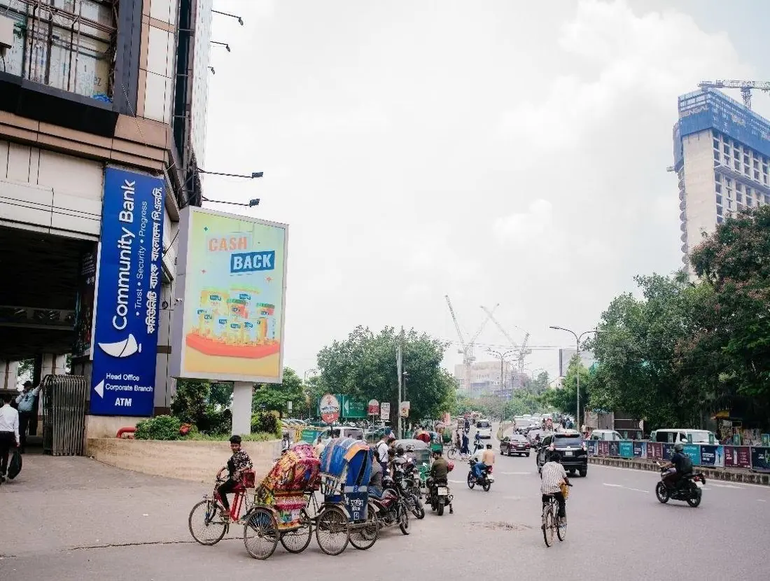
Here is a small test. Next time you are stuck in traffic at Bijoy Sarani, count the billboards you can actually read before the signal turns green. Not look at. Read. My guess is a short list, and the boards on it will have one thing in common: they say very little, very loudly.
The short answer: good billboard design tips all come back to one idea. You are designing for someone who is moving and will give you a few seconds at most. So use one message, about seven words or fewer, very big type, strong colour contrast, one image and a logo that is easy to find. Then build the artwork for the exact size and shape of the board you booked.
This is the brief I would hand to a designer before any outdoor advertising design work starts.
How to design a billboard: start with one message
Start by choosing one message, because a billboard does one job well. Pick that job before anyone opens a design file.
A press ad can explain. A social post can link somewhere. A billboard can do neither. So ask one question: if a person remembers a single thing from this board, what should it be?
- A name: "this brand exists, remember it".
- A launch: "the new one is here".
- A place: "we are open in this area now".
- A mood: one picture and a line that makes people smile.
Choose one. My test is simple. If you cannot say the message to a friend in one breath, the board cannot say it either.
How many words should a billboard have?
Seven words or fewer for the main line, plus your logo. That is my working rule, not a law.
Think of the billboard as a headline with no article under it. These usually have to go:
- Long phone numbers. Nobody in a CNG is writing down eleven digits.
- Web addresses, social handles and QR codes on roadside boards.
- Lists of branches or features.
If you need a response, give people one short thing they can search for later, such as the brand name. And pick one language for the headline, Bangla or English. Both at once means two small headlines instead of one big one.
Big type, strong contrast, and the colours that work
Make the type much bigger than looks polite on your monitor, and put it on a background that fights with nothing.
Use a bold, plain typeface. Thin letters, script fonts and tight spacing melt together from far away. A quick check I like: shrink the artwork on your phone to the size of a postage stamp. Can you still read the headline?
What colours work best on a billboard?
Colours with a strong difference between light and dark work best. Dark text on a light background, or light text on a dark one. Yellow with black, white on deep blue and white on red are safe, loud pairs. Pale grey on white is not.
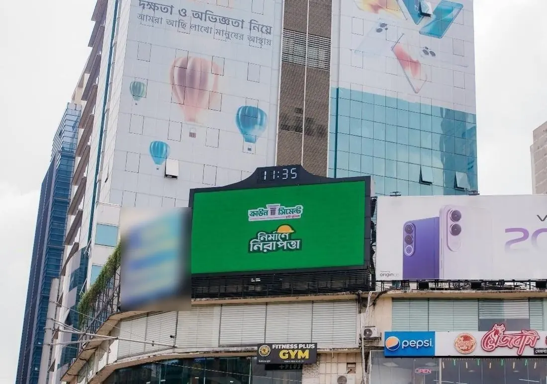
Daylight matters too. In our records most LED screens are on air from 7 am to 7 pm, so your creative has to win against the sun, not a dark room. Soft pastels that look lovely in a meeting can wash out at noon. And never lay text over a busy photo.
One image, and where the logo goes
Use one strong picture and let it take up a lot of room. Not a collage.
The eye should land on the image, slide to the headline and finish on the logo. Three stops. If there is a fourth, something needs to leave.
For the logo, my advice is:
- Put it in a corner or along one edge, and keep it there across every board in the campaign.
- Make it bigger than your brand guideline suggests for print.
- Leave clear space around it, and keep all key content a little way in from the edges.
A special case is the tri-vision board, which turns to show three faces in turn. Our Paribagh tri-vision site has three faces of 20 × 10 ft each. Each face should make sense alone, because a passer-by may only catch one.
Design for the actual size and orientation
Ask for the exact size and orientation of the site before design starts, then build the artwork to that shape. Never stretch one master layout to fit everything.
Billboards are not one standard rectangle. Here are real examples from AD Pro's site records.
| Site | Format | Size | Shape | Design note |
|---|---|---|---|---|
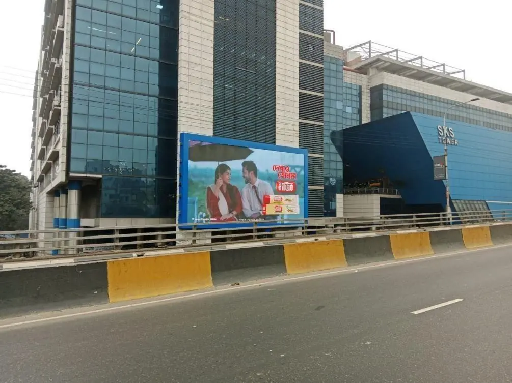
| SKS Tower, Flyover View, Mohakhali | LED screen | 50 × 30 ft | Landscape | Product on one side, headline on the other. |
| Police Plaza, Front Side, Gulshan | LED screen | 10 × 13 ft | Portrait | Stack it: image on top, headline, then logo. |
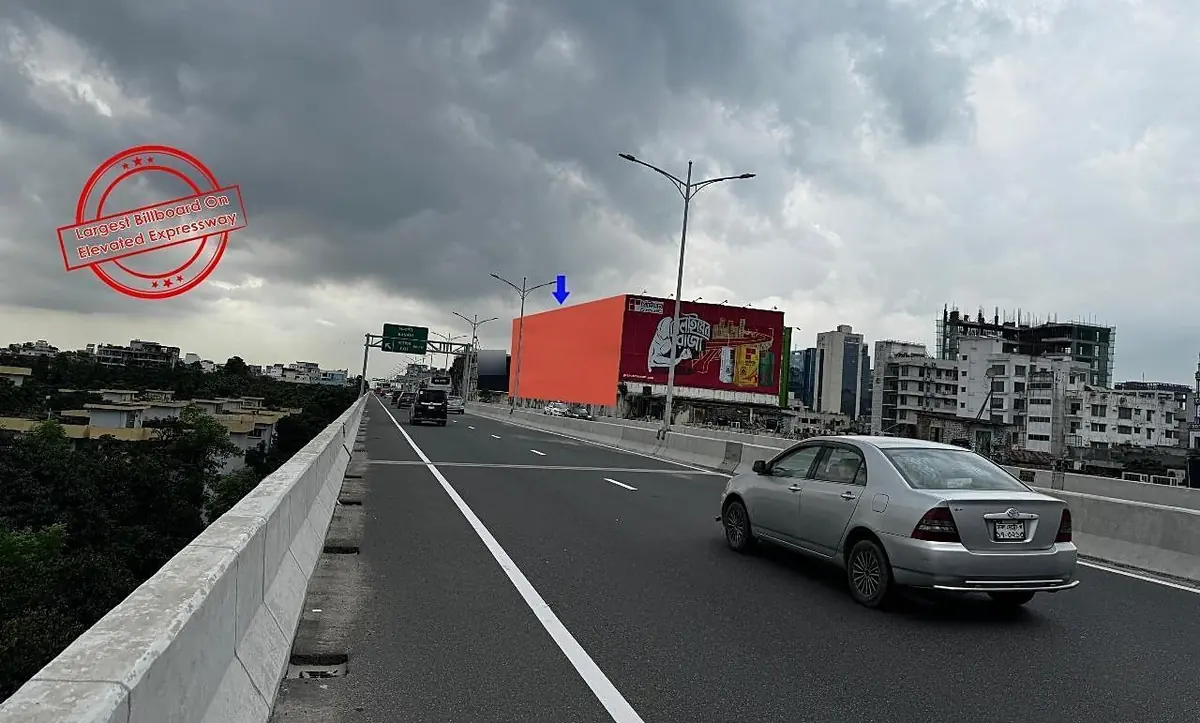
| Dhaka Elevated Expressway, Chairman Bari Crossing | Lighting billboard | 125 × 40 ft | Very wide landscape | One line of text across. |
| Mirpur-10 Circle, near the Metro station | Billboard | 26 × 50 ft | Tall portrait | Short words, stacked. |
| Shimanto Square Market, Dhanmondi | Billboard | 50 × 10 ft | Long strip | Logo, a few words, one small visual. |
The 125 × 40 ft Elevated Expressway board is more than three times as wide as it is tall. The 26 × 50 ft board at Mirpur-10 Circle is almost twice as tall as it is wide. Squeezing one layout into the other is like wearing your brother's panjabi to a wedding. It goes on. Everyone can tell.
If your campaign uses both landscape and portrait sites, plan two layouts from day one. Same message, same colours, same picture, arranged twice.
Should LED billboard creative be different from a printed board?
Yes. A printed board sits still, and regular commuters pass it again and again. An LED billboard spot is short, shares the screen with other ads and is allowed to move.
Take a static billboard first. The same people pass it every morning, so it has to be simple enough to read on day one and pleasant enough to live with for the whole campaign.
For LED billboard creative, my rules are these:
- Treat it as a poster that moves. There is no sound, so nothing can depend on a voice or a jingle.
- Keep the brand on screen the whole time. People look up in the middle of your spot, not at the start.
- Use slow, simple motion. One thing moves at a time. Fast cuts turn into a blur from a moving car.
- Hold the key frame. Let the headline and logo sit still for a good part of the spot.
- Match the pixels. Build to the screen's own resolution and shape.
That last point needs real numbers. In the records, SKS Tower, Flyover View is a 50 × 30 ft landscape screen with a 3840 × 2160 resolution and P10 pitch. It is the largest screen in AD Pro's network. The Police Plaza front screen facing Gulshan-1 is a 10 × 13 ft portrait screen at 1080 × 1920 with P5 pitch. One landscape video will not serve both. A vertical edit suits the portrait screen far better than a cropped wide one.
Timing shapes the creative as well. The Kandirpar screen in Cumilla is on air from 5 pm to 9 pm only. For an evening screen I would lean on deep, rich colours and avoid a large plain white background.
Billboard ad design in Bangladesh: do and avoid
Do keep it to one message, few words, big type and one image. Avoid anything that needs a second look. These choices decide whether billboard ad design in Bangladesh works on the road or only on the monitor, so if your designer reads one part of this article, make it this table.
| Do | Avoid |
|---|---|
| One message per board | Three offers, a slogan and a list of branches |
| Seven words or fewer in the main line | Full sentences and long phone numbers |
| Bold, plain type at a very large size | Thin, script or tightly spaced fonts |
| Strong light and dark contrast | Text laid over a busy photo |
| One large image | A collage of small pictures |
| Logo in the same clear spot on every board | A tiny logo pushed against the frame |
| Artwork built to the real size and orientation | One layout stretched to fit every site |
| Slow, simple motion on LED, with the brand always visible | A TV commercial with the sound removed |
What file do I send for a billboard?
For an LED screen, send a video or still image made at the screen's own resolution and orientation, for example 1920 × 1080 for many of our landscape screens or 1080 × 1920 for the Police Plaza front screens. For a printed board, send high-resolution artwork built to the board's exact proportions, with the logo and text kept as sharp vector shapes where possible.
Specifications differ from site to site, so ask us for the details of your booked site before the designer exports anything.
The short version, and what to do next
Good billboard design is mostly the courage to leave things out. One message, seven words or fewer, big bold type on a high-contrast background, one image, a logo that is easy to find, and artwork built for the real size and orientation of each site.
Not sure which shape you are designing for yet? Start with the site. Browse every location, with its size and format, in our directory of billboard sites, or look at one area such as Gulshan. Then call or WhatsApp +880 1958-503753 to check availability, or use the contact page. We will share a plan along with the artwork details for each site.
Frequently asked questions
- How many words should a billboard have?
- Aim for seven words or fewer in the main line, plus your logo. That is a working rule, not a law. Drop long phone numbers, web addresses and lists of branches, because people passing in traffic cannot note them down. Give them one short thing to remember, such as the brand name.
- What colours work best on a billboard?
- Colours with a strong difference between light and dark work best: dark text on a light background or light text on a dark one. Yellow with black, white on deep blue and white on red are safe pairs. Avoid pale tones and text over busy photos, especially on screens that run in daylight.
- Should LED billboard ads be different from printed ones?
- Yes. A printed board is seen by the same commuters every day, so it should be simple and pleasant to live with. An LED spot is short and silent, so treat it as a poster that moves: slow motion, the brand on screen throughout, and artwork made at the screen's own resolution.
- What file do I send for a billboard?
- For an LED screen, send a video or still image at the screen's own resolution and orientation, such as 1920 × 1080 for many landscape screens or 1080 × 1920 for a portrait screen. For print, send high-resolution artwork in the board's exact proportions. Ask AD Pro for the site's details before exporting.
- How do I design for a portrait billboard?
- Stack the layout instead of spreading it out: image on top, a short headline in the middle and the logo at the bottom. Use short words so the type can stay large. AD Pro's portrait sites include a 10 × 13 ft LED screen at Police Plaza and a 26 × 50 ft board at Mirpur-10 Circle.